
Default
Cancel
Using ChatGPT to Visualize Ransomware Leak Site Data
Recently I wanted to test out if I could use OpenAI’s ChatGPT to assist with analyzing trends around ransomware leak site postings.
Project Setup
The Raw Data
RansomWatch is a publicly accessible project that monitors ransomware leak sites and posts metadata to their website. Technical details on RansomWatch can be found on Github.
For the sake of this project I downloaded a recent copy of all the RansomWatch postings from their github in .json format
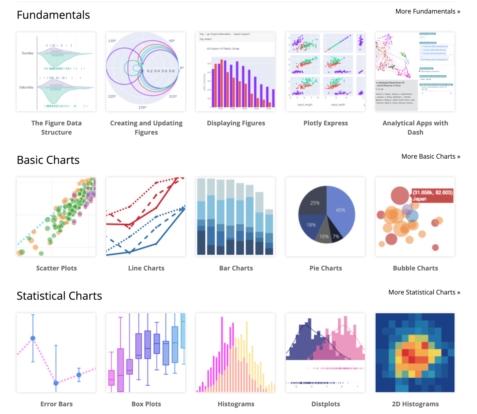
Python Data Visualization Library
To visualize this data I’ll be asking ChatGPT to write python3 code using the plotly library. Plotly is open source graphing library for python. The plotly library can be installed via pip, the python package manager.
Working with ChatGPT
ChatGPT is a chatbot built on top of OpenAI’s GPT-3.5 family of large language models. One important thing to note is that ChatGPT works in “conversations”. If you feel like ChatGPT has gotten stuck or isn’t giving you the results you’re looking I’ve found it’s beneficial to start a new conversation with no chat history that might influence the output. OpenAI has blog post that explains more in depth how it works - here’s one of the provided limitations:
“Ideally, the model would ask clarifying questions when the user provided an ambiguous query. Instead, our current models usually guess what the user intended.”
ChatGPT Prompts
Initial Prompt
Given a json file (“posts.json”) containing multiple posts, provide python3 plotly code to demonstrate the posting frequency of each group (“group_name”) over time, the json data contains timestamps data in the “discovered” field
ChatGPT Output:
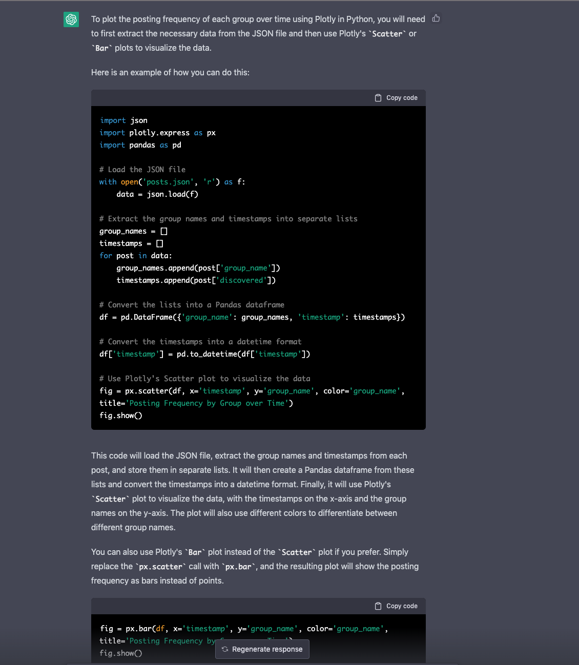
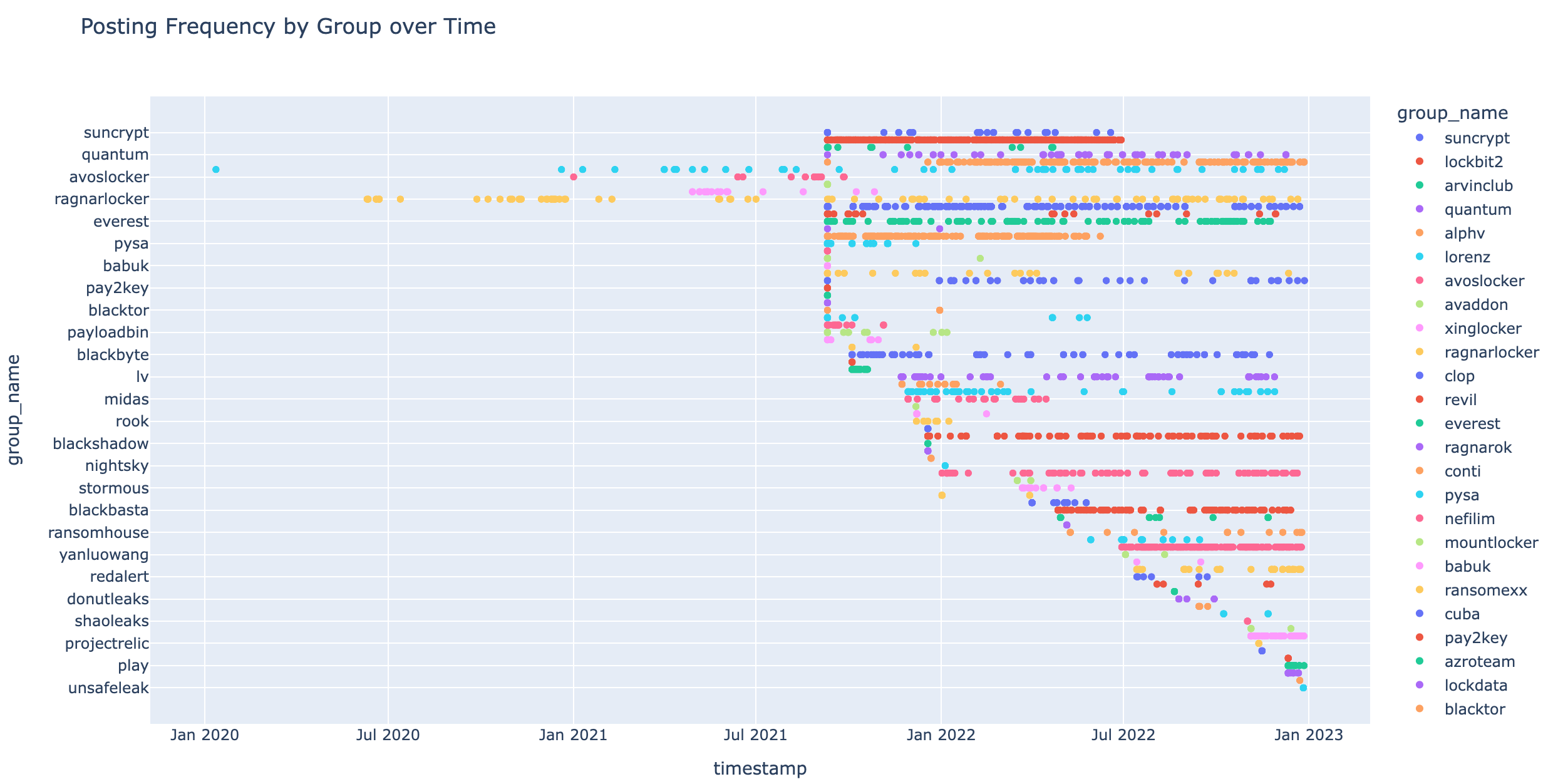
Code Result:
Additional Filters
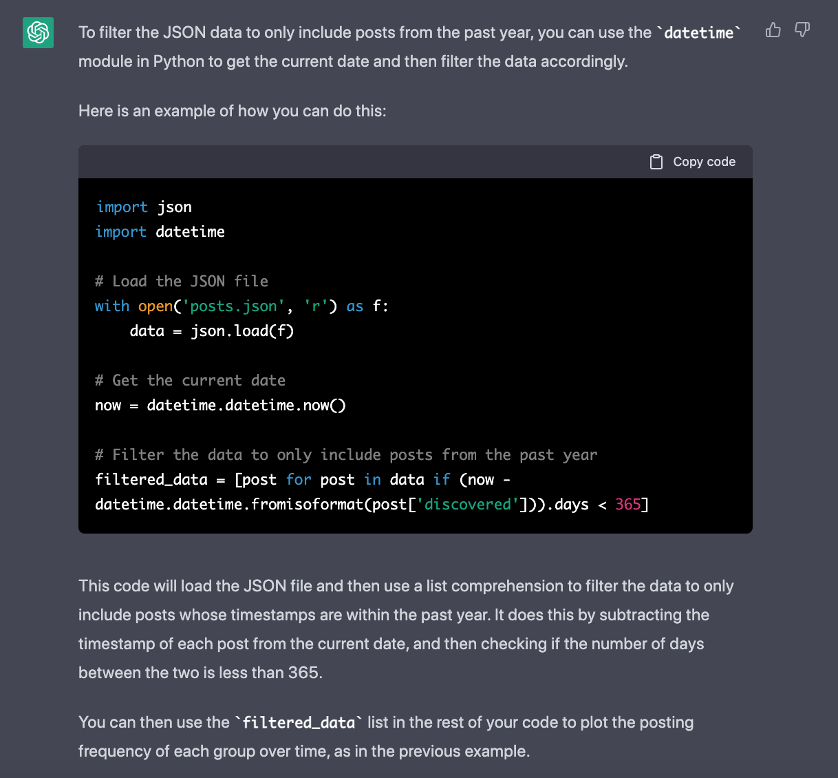
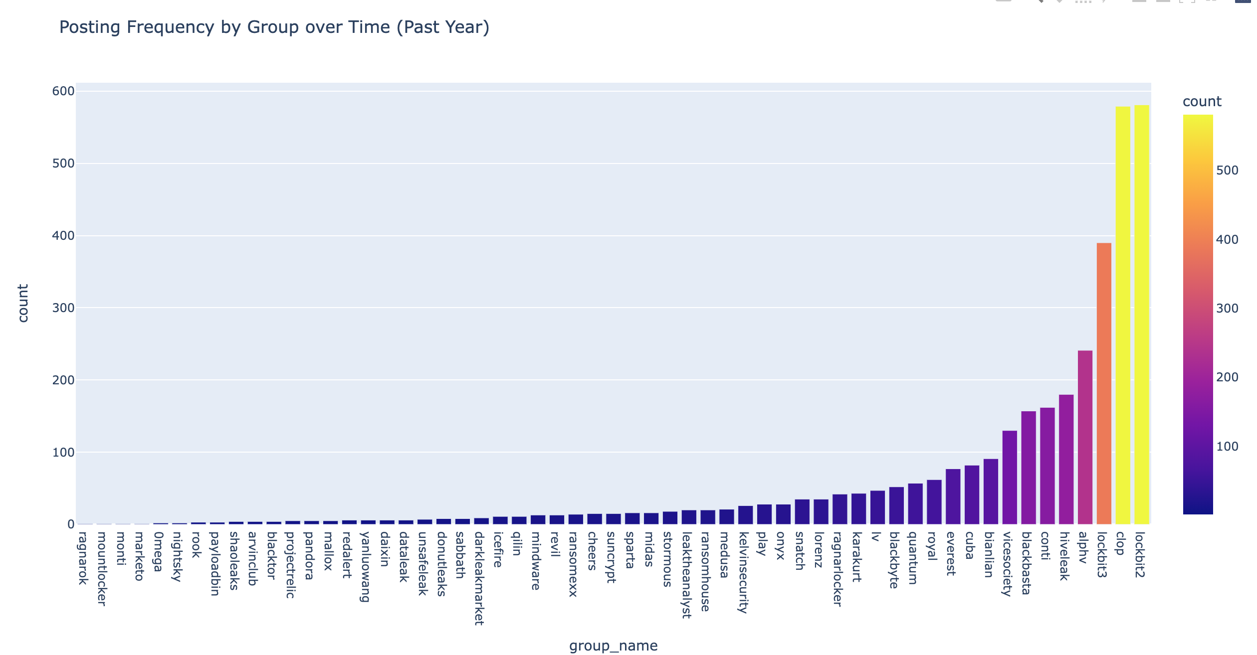
Within the same conversation I asked ChatGPT to filter the data to only the past 365 days.
What code is needed to filter the above json data to the past year only?
ChatGPT Output:
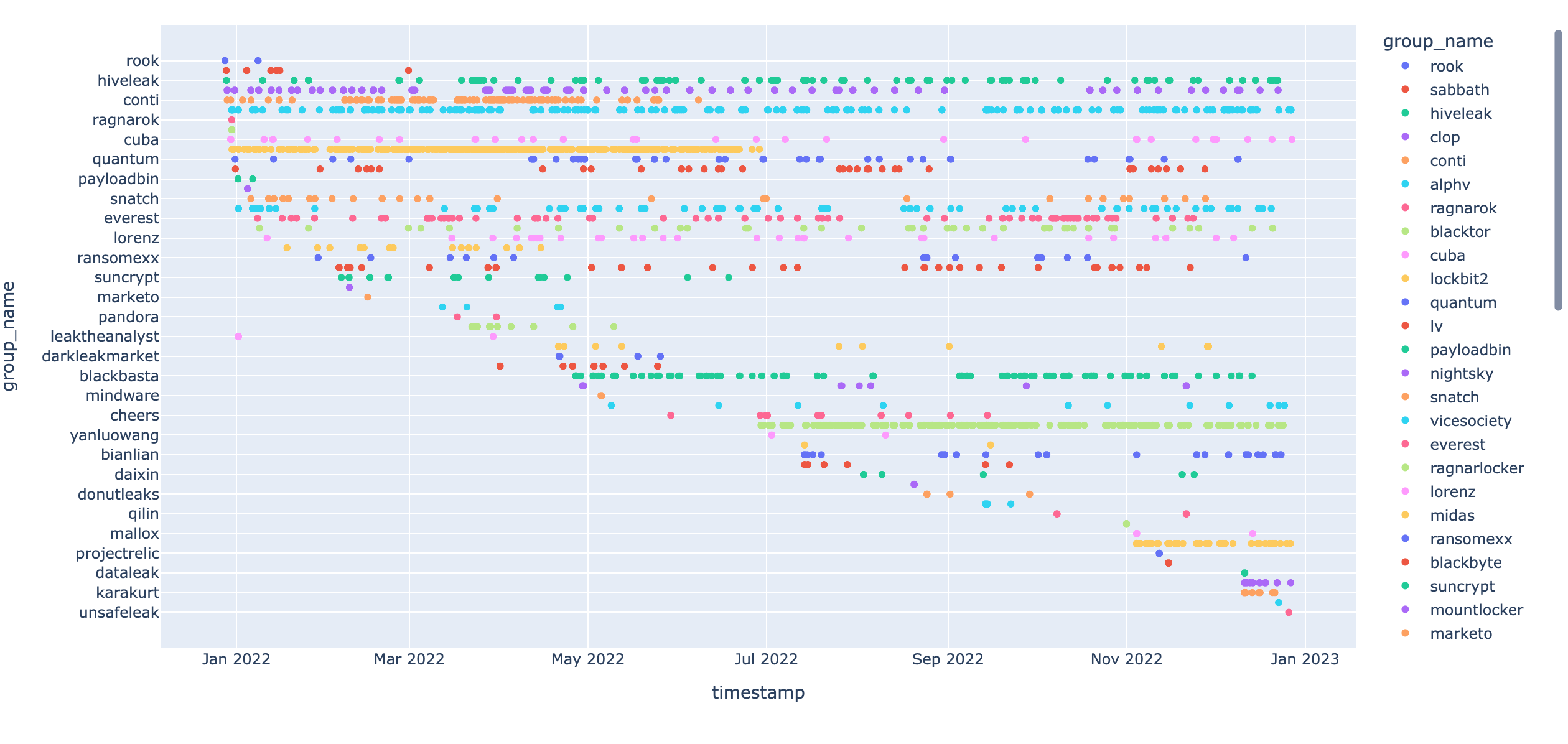
Code Outcome:
Cleaning up the graphics
Now that we’ve filtered the results down to the past year, lets try to make it easier to look at and understand.
There are a large amount “group_name” values, the y-axis is hard to read on the Plotly graphic, how can I update the code to make the y values easier read and sorted by most postings?
ChatGPT Output:
 <snipped to save space>
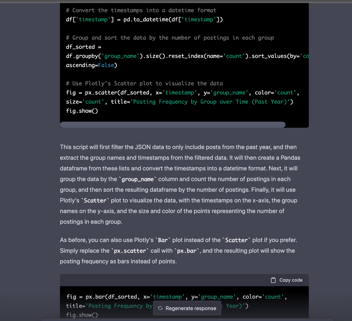
At this point ChatGPT has provided us with a few different solid code examples to work with. Not all of them are perfect but with some minor adjustments I was able to get some pretty nice results!
Changing data graphing formats
Plotly has a wide breadth of different graphing capabilities, lets ask ChatGPT to change things up a bit!
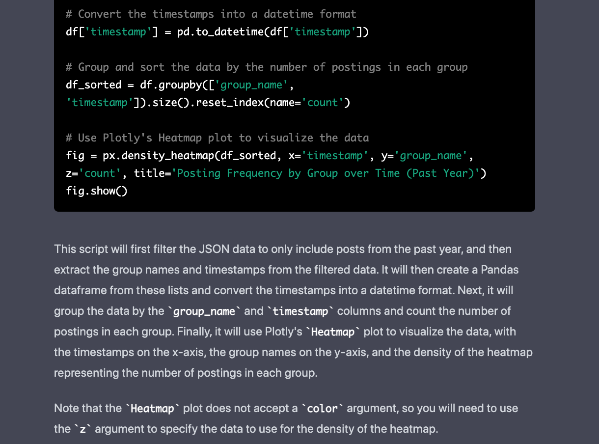
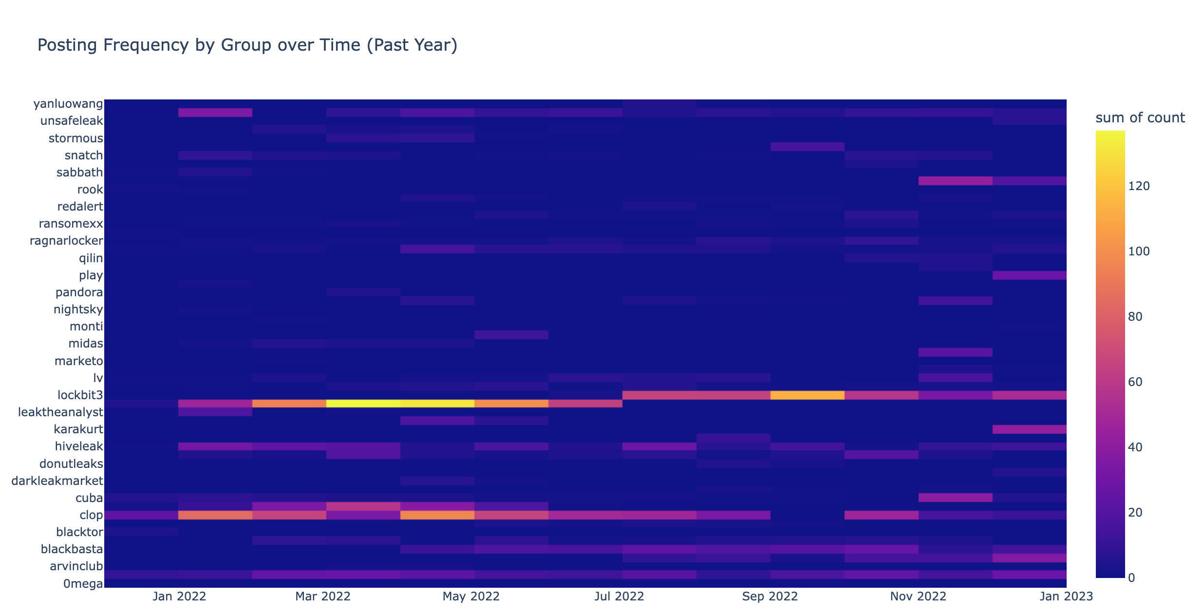
How can I modify this code to use a density heatmap
 <snipped to save space>
Code Outcome:
Some final touches
To make things more modular I asked ChatGPT to wrap the code into a function
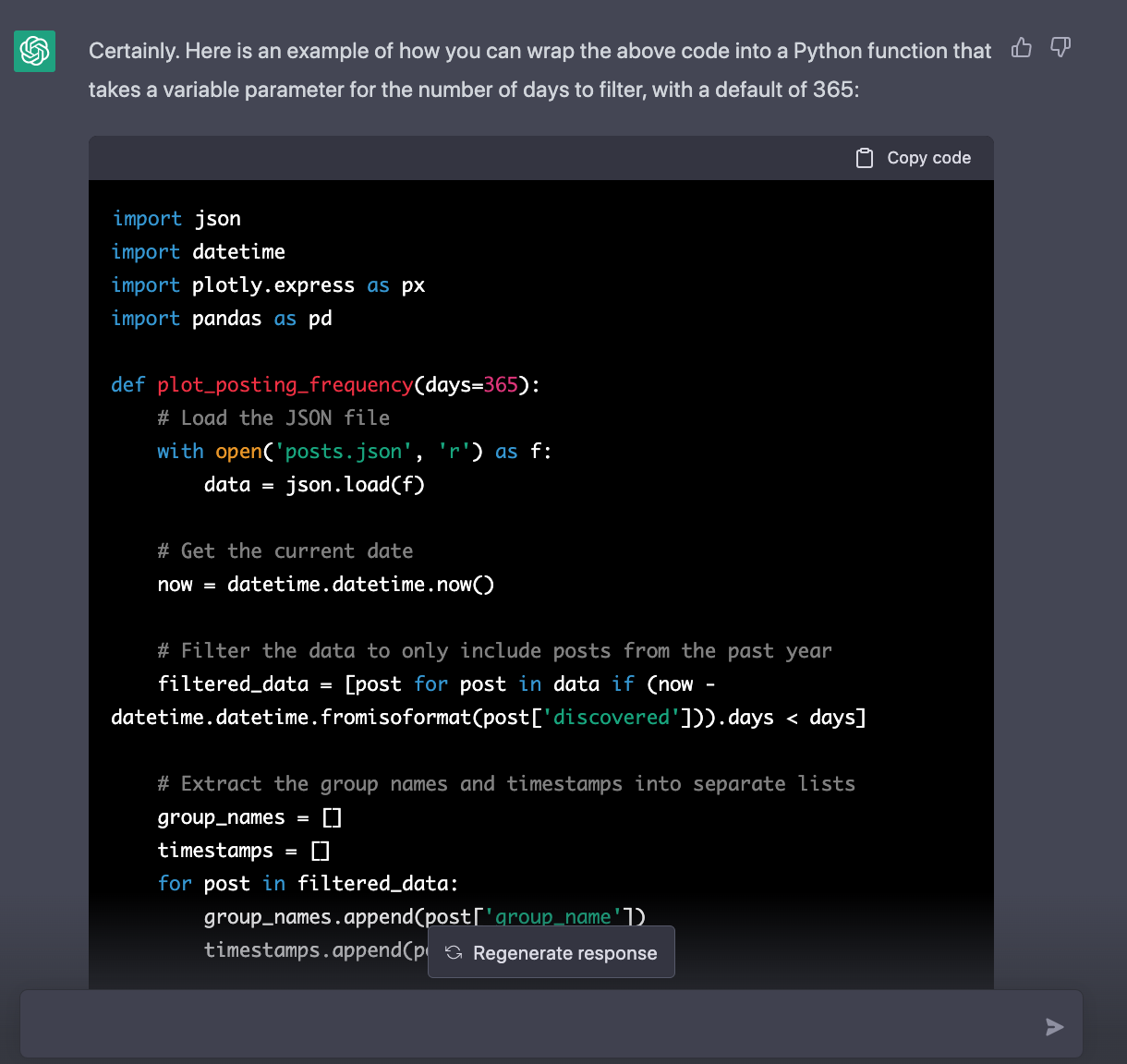
Can you wrap the above code into a python function? The function should have a variable parameter for the number of days to filter, with a default of 365
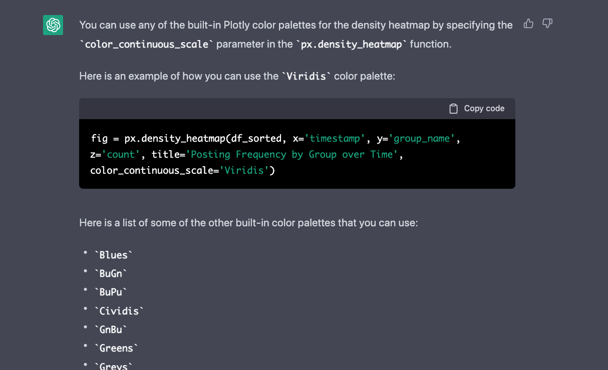
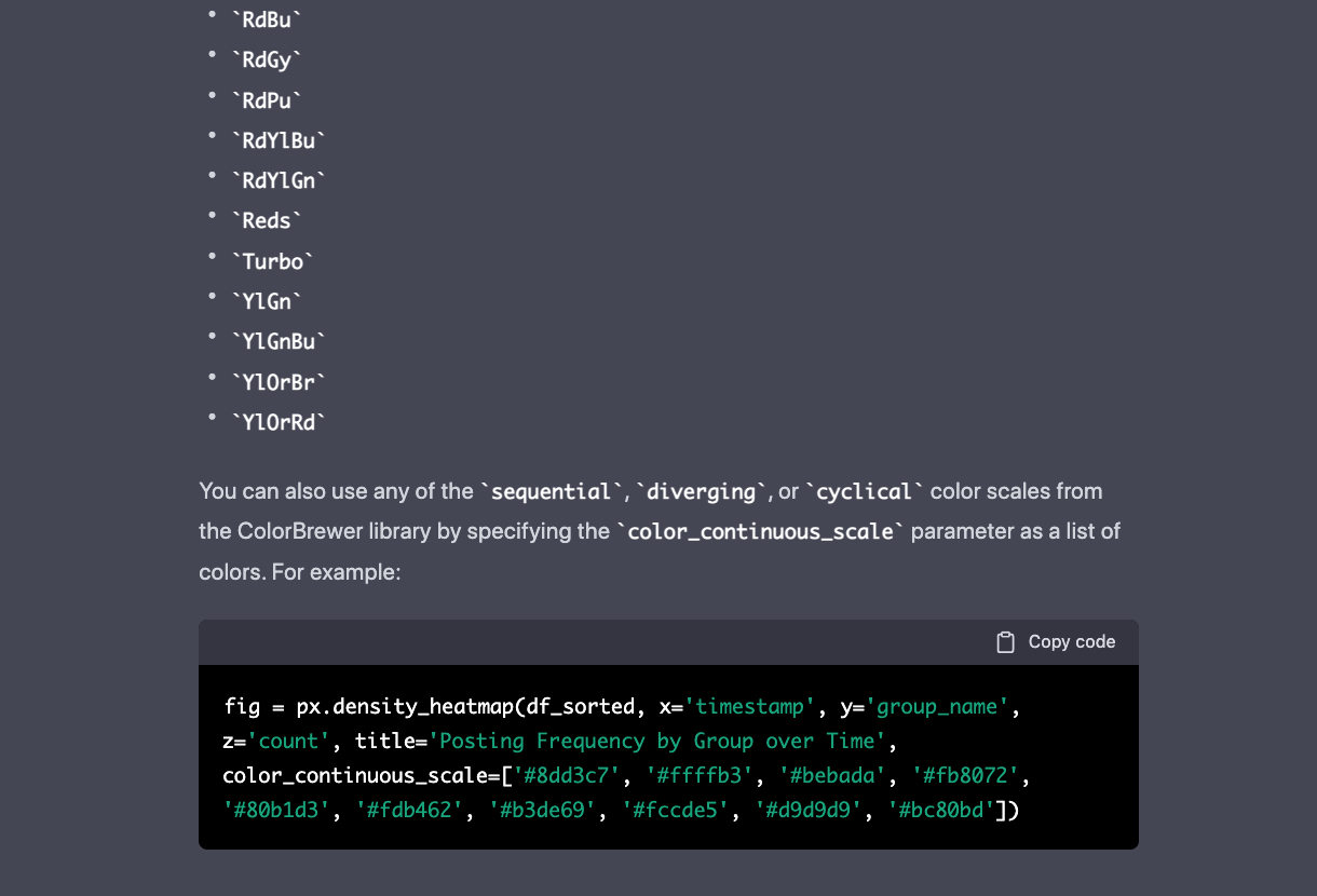
I also wanted to see what color customization options exist.
What other plotly color palette could I use for this?
 <snipped to save space>
Closing Thoughts
Overall ChatGPT is very powerful tool to augment small development projects. ChatGPT saved me a significant amount of time I otherwise would have spent web searching and reading Plotly documentation. I believe that it’s still important to have the programming fundamentals required to modify the ChatGPT output if needed. Hopefully this blog post provided some ChatGPT inspiration!
Final Code
The final scripts have been uploaded to a new Github repository: